Checkout & Payments
Variant controls
Button options, image swatches, dual dropdowns, hide out-of-stock
In one sentence
What it is
Variant controls give shoppers a clear, well-presented way to choose between a product's options — buttons, image swatches, dual dropdowns, and the ability to hide options that are out of stock — so choosing the right version of a product is fast and unambiguous.
How it works
What it does
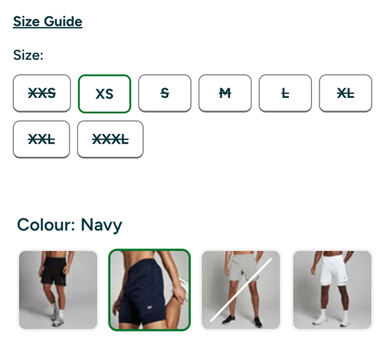
On the product page, variant selection is presented using the format best suited to the option type: colour and pattern options as image swatches, simple options as button groups, and products with two independent option dimensions (say, size and colour) as dual dropdowns. Out-of-stock variants can be configured to hide entirely rather than show as disabled, so shoppers aren't shown options they can't actually buy. The brand controls the presentation format and the out-of-stock behaviour per product type, so the right control is used for the right kind of choice.
The problem it solves
Why it matters
For the brand
A poorly presented variant picker — a plain dropdown for a colour choice, or greyed-out sizes cluttering the page — adds friction to the exact moment a shopper is deciding to buy, and confused or frustrated variant selection is a common, avoidable cause of abandonment and mis-ordered returns.
For their customers
Picking the wrong colour from a text-only dropdown, or scrolling past a wall of unavailable sizes to find the one they can actually buy, makes a simple decision harder than it needs to be.
For shoppers
How it benefits shoppers
- See colours and patterns as actual images, not text labels that require guesswork.
- Choose from clean button options for simple choices, without a fiddly dropdown.
- Handle two independent options (like size and colour) cleanly without confusing combinations.
- Only see the options that are actually in stock, when the brand chooses to hide unavailable ones.
For the brand
How it benefits the brand
Reduces friction and confusion at the point of variant selection
Product page conversion rate
Cuts mis-ordered returns caused by unclear or ambiguous variant choice
Variant-related return rate
Presentation matches the option type, improving perceived product-page quality
Product page engagement, bounce rate
Configurable per product type without a bespoke build for each range
Time to configure a new product line
In practice
What it looks like
- 1
A shopper opens a product page for a t-shirt available in five colours and six sizes.
- 2
Colours are shown as image swatches so they can see the actual shade rather than reading a name.
- 3
Sizes are shown as a clean button row, with any sold-out sizes hidden per the brand's configuration.
- 4
They select colour and size in two taps and add to basket with no ambiguity about what they're buying.
Where it lands hardest
Strong use cases by industry vertical
Health & nutrition
Useful for flavour and size options on supplements, where button-style controls suit the limited option set well.
Beauty & personal care
Shade swatches are essential here — an accurate visual representation of colour is central to purchase confidence.
Food, drink & FMCG
Relevant mainly for flavour and pack-size choices; simpler button controls generally suffice.
Pet care
Useful for size options on collars, beds and clothing, and flavour options on treats and food.
Fashion & apparel
The strongest fit — dual dropdowns for size and colour, and image swatches for pattern and colourway, are core to how fashion product pages need to work.
Luxury & premium
Presentation quality matters more than in any other vertical — poorly rendered swatches or clunky dropdowns undercut a premium product page noticeably.
Common questions & objections
What clients usually ask
Why the platform version wins
Because the control style is a configuration layer over the same product and inventory data used elsewhere on the page, a brand can present variants consistently and accurately without maintaining a second, separate front-end build per product type.