Experience & Engagement
Sticky header & options bar
Header stays visible; slim bar for USPs and quick links
In one sentence
What it is
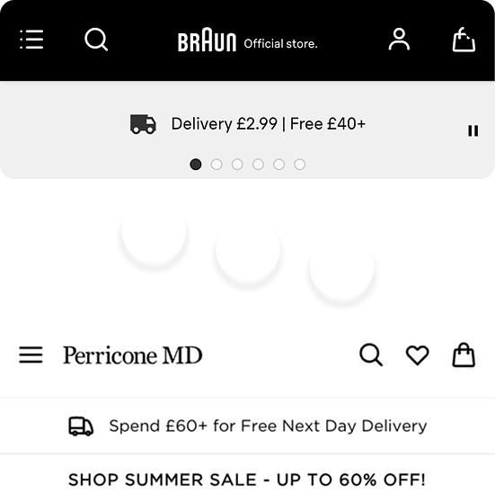
A header that stays visible as the shopper scrolls, paired with a slim options bar for USPs and quick links. So navigation, search and key messages are never more than a glance away, however far down the page someone scrolls.
How it works
What it does
Once enabled for a brand, the main header, logo, navigation, search and basket remains fixed at the top of the viewport as the shopper scrolls down a page, rather than scrolling away with the content. A slim options bar can sit above or alongside it, carrying short messages such as free delivery thresholds, seasonal offers or quick links to key pages. Both elements are configured per brand as toggles; the content within the options bar (the actual USP text and links) is managed through the platform's content tooling, so the messaging can be changed for a sale or campaign without needing a new toggle request each time.
The problem it solves
Why it matters
For the brand
On long category and content pages, a header that scrolls away with the page forces the shopper to scroll all the way back to the top to search, switch category or check the basket, friction that costs both engagement and conversion, and makes it harder to keep a promotional message in view throughout a session.
For their customers
Losing access to search or the basket partway through a long scroll is a small but real annoyance, especially on mobile where scrolling back up is slower and more deliberate than on desktop. It disrupts the sense of being in control of the shopping journey.
For shoppers
How it benefits shoppers
- Search, navigation and the basket are always one tap away, however far down a page they've scrolled.
- Key offers and delivery information stay visible throughout the session rather than being seen once and forgotten.
- A more app-like, modern browsing feel that reduces the friction of long category or content pages.
- Faster path back to browsing or checking out without having to scroll back to the top of the page.
For the brand
How it benefits the brand
Persistent access to search and basket supports conversion on long pages
Conversion rate on category and content pages
Constant visibility for delivery thresholds and offers
Average order value, promotional message reach
Content team can change messaging without a new enablement request
Time to update campaign messaging
Reduces exit points caused by lost navigation access
Bounce rate on long-scroll pages
In practice
What it looks like
- 1
The product team enables the sticky header and options bar for the brand.
- 2
The content team sets the options bar message to a free-delivery threshold ahead of a seasonal promotion.
- 3
A shopper scrolls deep into a long category page browsing products.
- 4
The header and options bar remain visible throughout, so they can search, switch category or check the delivery threshold without scrolling back up.
Where it lands hardest
Strong use cases by industry vertical
Health & nutrition
Useful on long, education-heavy content pages where shoppers scroll extensively through guides before returning to shop, keeping the path to purchase always available.
Beauty & personal care
Long, image-heavy category pages benefit from persistent search and basket access, and the options bar is a natural home for gift-with-purchase messaging.
Food, drink & FMCG
Good fit for large catalogues with long category pages, particularly for surfacing delivery thresholds that drive basket-building behaviour.
Pet care
Helpful for large product ranges (multiple breeds, sizes, life stages) where long scrolls are common and quick access back to search matters.
Fashion & apparel
Long, visually dense category and lookbook pages benefit from constant access to search and basket, and promotional messaging around sales.
Luxury & premium
A sticky header is useful functionally, but the options bar should be used sparingly, since heavy promotional messaging can undercut a premium tone.
Common questions & objections
What clients usually ask
Why the platform version wins
Because the options bar content sits in the same content tooling as everything else, the brand isn't dependent on the product team every time a promotional message needs to change. Enablement is a one-off request, and day-to-day use is self-serve.