Experience & Engagement
Editorial styling controls
Text alignment and alternate editorial layouts
In one sentence
What it is
Fine-grained controls over text alignment and alternate editorial layouts within content widgets, so campaign pages can carry a magazine-grade look rather than a fixed, boxy template feel.
How it works
What it does
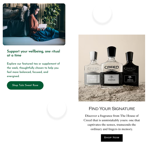
Within the standard widget library, editorial styling controls let a merchandiser choose how text sits against imagery, left, right or centre-aligned, overlaid or beside the image, and switch between alternate layout treatments for the same content block. This turns a single widget type into several visually distinct compositions without needing a bespoke build for each one. It's a per-brand toggle: once switched on for a brand, the additional layout options appear inside the existing page builder, so the same team that builds pages today gains more creative range without new training or tooling.
The problem it solves
Why it matters
For the brand
A widget library that only ever produces one visual arrangement per block type makes every campaign page look like the last one, which is a problem for brands whose positioning depends on feeling considered and editorial rather than templated. Without layout variation, teams either accept visual sameness or commission bespoke page builds to get the look they actually want.
For their customers
Shoppers absorb visual cues about quality before they read a word of copy. A page that looks identical in structure to every other page on the site, campaign after campaign, reads as generic, undermining the sense of craft a brand may have spent heavily on in its photography and copywriting.
For shoppers
How it benefits shoppers
- Campaign pages feel considered and editorial rather than assembled from an identical template each time.
- Imagery and copy are arranged in whatever way tells the story best, rather than forced into one fixed layout.
- A more premium, magazine-like browsing experience that matches the quality of the products being sold.
- Visual variety across a session keeps pages feeling fresh rather than repetitive as a shopper browses multiple campaigns.
For the brand
How it benefits the brand
Differentiated page composition without bespoke development
Design distinctiveness at zero incremental build cost
Same content team can produce a wider creative range
Campaign variety per quarter
Reduces need for one-off page builds outside the widget system
Bespoke build requests avoided
Supports brand positioning that depends on an editorial feel
Brand perception, dwell time on content pages
In practice
What it looks like
- 1
A merchandiser opens the page builder to design a new seasonal campaign landing page.
- 2
For a key editorial block, they switch the text alignment from centred to right-aligned over the image and pick an alternate layout treatment.
- 3
The preview updates instantly, showing the new composition on desktop and mobile.
- 4
They publish the page, which now reads visually distinctly from the brand's last three campaigns despite reusing the same widget type underneath.
Where it lands hardest
Strong use cases by industry vertical
Health & nutrition
Useful for brands moving upmarket from a functional, clinical presentation toward a more considered wellness aesthetic. Layout variety supports that shift without a rebuild.
Beauty & personal care
Beauty brands live and die on editorial polish, and this closes much of the gap between a widget-built page and a bespoke magazine-style landing page.
Food, drink & FMCG
Helpful for premium or provenance-led ranges telling a story about origin or craft, though most everyday FMCG content prioritises clarity over editorial flourish.
Pet care
Useful for premium or lifestyle-positioned pet brands, less critical for functional, repeat-purchase-driven ranges where clarity beats styling.
Fashion & apparel
Lookbooks and drop pages benefit directly from layout variation that keeps pace with a fast-moving content calendar.
Luxury & premium
Luxury shoppers notice templated pages quickly, and editorial styling controls help close the gap toward a genuinely bespoke feel without bespoke cost.
Common questions & objections
What clients usually ask
Why the platform version wins
Rather than choosing between a rigid templated CMS and a fully bespoke build, editorial styling controls sit in between. Genuine layout variety, delivered inside the same governed, self-serve page builder the content team already uses.