Experience & Engagement
Carousel & layout controls
Desktop carousels, section-peek item limits
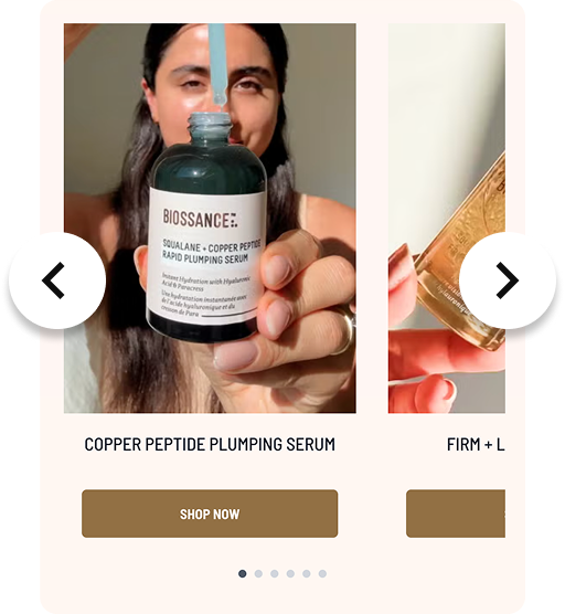
In one sentence
What it is
Configuration over how content and product carousels behave, desktop carousel treatment and how many items 'peek' into view at the edge of a section so merchandisers can tune density and pacing to match the range and the brand's visual style.
How it works
What it does
For any widget or product rail that displays multiple items in a row, carousel and layout controls let the brand configure whether desktop shows a scrolling carousel or a static grid, and how many items are visible at once, including a partial 'peek' of the next item to signal there's more content to scroll to. This is a mix of a toggle (carousel on or off) and configured values (number of items, peek behaviour) set per brand, and in many cases per placement, without requiring a new build each time a merchandiser wants a different density on a given page.
The problem it solves
Why it matters
For the brand
A one-size layout for every product rail and content section forces a trade-off no single brand should have to accept: either everything is cramped to fit lots of items, or everything is oversized and shows too little at once. Ranges and merchandising strategies differ. A wide catalogue needs different density controls to a narrow, curated one, and without configuration, the layout can't reflect that.
For their customers
Grids that show too few items force excessive scrolling to browse a category; carousels with no visual cue that more items exist get abandoned after the first visible row. Either way, products further along in the rail simply never get seen.
For shoppers
How it benefits shoppers
- Browsing density matches the way the brand actually merchandises, rather than a generic default that under- or over-shows the range.
- A visible 'peek' at the edge of a carousel signals there's more to see, encouraging exploration rather than assuming the section is finished.
- Faster scanning of a category or campaign section because the layout is tuned to the number of items actually worth showing at once.
- Consistent, predictable interaction patterns across the site rather than a jarring mix of carousel and grid behaviours.
For the brand
How it benefits the brand
Merchandising density tuned to the range without a rebuild
Items viewed per session on carousel sections
Peek behaviour increases scroll-through on product rails
Carousel engagement / scroll depth
One configuration change applies across every placement using the pattern
Consistency of layout across the site
Reduces bespoke development requests for layout tweaks
Development requests avoided
In practice
What it looks like
- 1
A brand launches a wide seasonal range and wants the homepage 'new in' section to show more items per view than the current default.
- 2
The product team applies the configured change: item count per row increased, and a small peek of the next item enabled at the right-hand edge.
- 3
A shopper landing on the homepage sees more of the new range at a glance, with a visible sliver of further items inviting a scroll.
- 4
They drag or click through the carousel, browsing the full new-in range without navigating to a separate category page.
Where it lands hardest
Strong use cases by industry vertical
Health & nutrition
Useful where ranges are broad (flavours, formats, goals) and a denser carousel helps shoppers scan variants quickly without leaving the page.
Beauty & personal care
Shade and product ranges are often wide, and carousel density directly affects how much of a range gets discovered in a single session.
Food, drink & FMCG
Useful for bundle or gifting sections with many options, though everyday grocery-style ranges may prefer a simple grid over a carousel.
Pet care
Helpful for cross-sell rails (accessories, treats, breed-specific items) where showing more at once supports impulse add-ons.
Fashion & apparel
Lookbook and 'shop the edit' rails benefit from carousel pacing and peek behaviour that mirrors how fashion content is typically browsed.
Luxury & premium
Luxury often prefers fewer, larger items per view rather than a dense carousel, so configuration should favour restraint over maximum density.
Common questions & objections
What clients usually ask
Why the platform version wins
Because carousel and layout behaviour is a configuration layer over the same widget system, tuning density doesn't require touching a template or commissioning new front-end work, a request to the platform team with the desired values is enough.